The oldest and one of the first paint companies in Portugal. Since 1931 they've been around and always top of mind. New re-branding/styling, organizing the pack info and product structure. The logo intervention couldn't be excessive. Minimization of pack production cost was applied. ENJOY...
Product packaging (Before)
Brand first logo & the actual (to be re-designed)
The aproach was mixing the caligraphic caracteristics with stiffed tall typography.
Resulting in a more flowing and unstiffed typography. I maintained the same weight and height, to reforce the resemblance to the old typography.
The brush, a very emblematic icon and recognized by the public suffered has the typography, slight changes in colour and shape. Unstiffed still technical, but smother movement, arched opsed to an arsh inclination.
The result reflects, not a big change but a more smother and embracing combination of the two elements.
An alternative approach of colours. Has a test only.
The structure of categories. Brand and Sub-Brands. Use of colour. Testing...
There where many problems for the consumer to identify the product, this was one of the solutions.
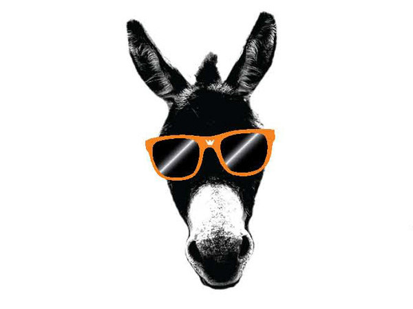
PARKING LOT logic. ( COLOR + ANIMAL + LETTER )
VARNISH + BROWN + PINE
________________________________________________
PRODUCT NAME + CATEGORY COLOUR + ILLUSTRATION
3D MOCK UP
STORE RENDER
FLEET
